Here is an example of two animations from the 11 second club competition. They take a quote from "Willy Wonka and the Chocolate Factory" (1971) and take it into two completely different directions with regards to story.
http://www.11secondclub.com/competitions/december09/winner deals with a poker game and http://www.11secondclub.com/competitions/december09/entry/l0zFU4 which is about a plane going down. Both are very interesting takes and because of the limitations of the quote, they naturally have to deal with the conflict between two characters but still, they are tackled in two very different ways.
The overall animation quality of the first clip is better than that of the second one but i feel that the second one has a higher level of characterisation and a better story. The ending where the parachute is taken by the more human character is unexpected and although not overly good technically, serves for a much more compelling story device than that of the poker animation. That being said, the overall emotions of the characters were stronger, from the look of disgust on the human's face to the sheer pride of the devil's victory. These things all gave themselves nicely to the atmosphere of the scene.
There are issues with both, like most things, such as some issues where the characters don't seem weighted properly but looking past that, it is nice to look at the thought process of two animators so that different ideas and approaches to the same subject can be compared and interpreted. I like the use of dialogue in these animations and they will prove to be a valuable resource when it comes to my animation and the quote that I must choose. It is clear that characterisation is powerful and so, in order to create a powerful animation, this must be explored through the superhero and quote that I choose.
Thursday, 26 January 2017
Choosing a character
https://uk.pinterest.com/josephlearoyd/facial-animation-references/
Here is the link to my pinterest board on facial animation which i used for my thought process when searching images.
When I heard that a superhero was the character design of this animation project, it was a great opportunity for me to explore an area that greatly influenced my decision to choose animation as a subject. Superheroes, comic books and superhero films have always been of great interest to me and so i was able to study the many possibilities for the animation. I started off by looking at various clips from Marvel and DC films as well as pinterest. I quickly ruled out the idea of using the film versions of various characters due to the need for the model to have an actor likeness rather than the original reference material. Looking next at action figures in order to see characters in a three dimensional space, i was able to look better into the various designs of the characters from their molds.


From here, i managed to narrow down the possibilities of the characters to a much smaller list, looking at smaller details such as "The Falcon's" tinted goggles and how that could be replicated in maya using material x texturing. I looked at the shape and form of various characters as well as through comics to see designs and movement of the heroes. The powerful thing about superheroes is the many incarnations of a hero based on the comic artist, the film versions, costume changes and the animated series versions. These were all taken into account as I looked through the designs.
https://s-media-cache-ak0.pinimg.com/736x/9d/25/f4/9d25f4a7fde7649f661fa900385bb457.jpg
 For example, these are just some of the many designs for Wolverine.
Looking at characters and how they were able to react to the quote was also a major situation. How would the quote affect the characterisation. After much debate, i eventually settled on the character of Nightcrawler from the X-Men. This teleporting superhero has been around in comics, films and animated shows for quite some time and is one of the most popular X-men characters.
https://blogger.googleusercontent.com/img/b/R29vZ2xl/AVvXsEgIqJfeEqz3-GX-rU3bvQOzZAgu1bAF403KmBqyUeMHDgfc0hwH6wFA8QSjEyCdDu1tM9vHl0liEmqUzjQ_TZo72zLCl2-oRS465cWz8a_UaVEc98npI7ebFxBb4nXSxSfRi5MN6uy7Nc3T/s320/Nightcrawler.bmp

Here we see some of the many versions of Nightcrawler. I have decided to go with the 1970s "Second Genesis" version of the character which can be seen here in a drawing:
https://s-media-cache-ak0.pinimg.com/564x/95/96/3b/95963b4e948847839ddb50537bfd7ddd.jpg

I plan to adjust this though to incorporate the xmen evolution animated series nightcrawler eye design, (above, bottom, middle) in order to create effective eye designs that can be used to show emotion in the character. This drawing is effective as it is colourful, conveys depth and form and highlights and shadows are clearly visible. Here is a side reference of the character.
https://uk.pinterest.com/pin/370350769335142703/

This provides a nice reference of the side of the head and the notably pointed ears of the character. This will be a challenge to create but with the right timing and work it is doable to create this character.
Here is the link to my pinterest board on facial animation which i used for my thought process when searching images.
When I heard that a superhero was the character design of this animation project, it was a great opportunity for me to explore an area that greatly influenced my decision to choose animation as a subject. Superheroes, comic books and superhero films have always been of great interest to me and so i was able to study the many possibilities for the animation. I started off by looking at various clips from Marvel and DC films as well as pinterest. I quickly ruled out the idea of using the film versions of various characters due to the need for the model to have an actor likeness rather than the original reference material. Looking next at action figures in order to see characters in a three dimensional space, i was able to look better into the various designs of the characters from their molds.


From here, i managed to narrow down the possibilities of the characters to a much smaller list, looking at smaller details such as "The Falcon's" tinted goggles and how that could be replicated in maya using material x texturing. I looked at the shape and form of various characters as well as through comics to see designs and movement of the heroes. The powerful thing about superheroes is the many incarnations of a hero based on the comic artist, the film versions, costume changes and the animated series versions. These were all taken into account as I looked through the designs.
https://s-media-cache-ak0.pinimg.com/736x/9d/25/f4/9d25f4a7fde7649f661fa900385bb457.jpg

Looking at characters and how they were able to react to the quote was also a major situation. How would the quote affect the characterisation. After much debate, i eventually settled on the character of Nightcrawler from the X-Men. This teleporting superhero has been around in comics, films and animated shows for quite some time and is one of the most popular X-men characters.
https://blogger.googleusercontent.com/img/b/R29vZ2xl/AVvXsEgIqJfeEqz3-GX-rU3bvQOzZAgu1bAF403KmBqyUeMHDgfc0hwH6wFA8QSjEyCdDu1tM9vHl0liEmqUzjQ_TZo72zLCl2-oRS465cWz8a_UaVEc98npI7ebFxBb4nXSxSfRi5MN6uy7Nc3T/s320/Nightcrawler.bmp

Here we see some of the many versions of Nightcrawler. I have decided to go with the 1970s "Second Genesis" version of the character which can be seen here in a drawing:
https://s-media-cache-ak0.pinimg.com/564x/95/96/3b/95963b4e948847839ddb50537bfd7ddd.jpg

I plan to adjust this though to incorporate the xmen evolution animated series nightcrawler eye design, (above, bottom, middle) in order to create effective eye designs that can be used to show emotion in the character. This drawing is effective as it is colourful, conveys depth and form and highlights and shadows are clearly visible. Here is a side reference of the character.
https://uk.pinterest.com/pin/370350769335142703/

This provides a nice reference of the side of the head and the notably pointed ears of the character. This will be a challenge to create but with the right timing and work it is doable to create this character.
Drawings of the face references
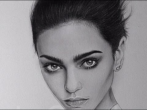
Firstly we have a drawing of a female character. The angle of the head works nicely here and the cheek bones can be seen as well defined and strong. The ear also manages to get a great level of detail in it and one can see it quite closely. The hair is quite detailed and it is overall a powerful drawing. If i was to find fault with it, it would be in the fact that it is hard to visualise the overall size of the head due to the angle and so, further references of the girl would be needed.

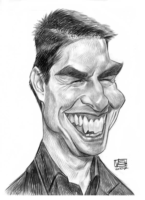
Tom Cruise is nicely represented as a caricature. I looked at the idea of caricatures as they are popular forms of cartoon imagery combined with drawings which manage to capture the emotions of a character through their expressions and physical features. From newspapers strips to Satirical shows such as "Spitting Image" (1984-1996), the caricature has always been popular. To take this idea into an animation or modelling point of view may work well. Accentuating the features of a superhero or famous character could add an interesting twist to it. Obviously the lack of realism would be the major flaw in this concept.

Finally, Hugh Laurie's character, Dr. Gregory House from "House M.D" (2004-2012) is a character that i find to be extremely compelling. The character, although fairly ordinary looking, has had his complex emotions captured perfectly by the artist here. The image creates depth and is extremely three dimensional. The look of his hair, eyes and shading around the nose and cheeks all make it easier to use this as a reference to form a good looking model. This would again, need to be grouped with other varying images of the side and back of his head but it is still a drawing that I found to be powerful as characterisation and the pain of the character comes through in the expression on the page.

Monday, 12 December 2016
Final Animation
My final animation of the Snake Charmer went better than I had originally thought. Looking at the various elements of what went well and what didn't will help me to develop for any future animations. Firstly, the opening shot from 0:00-0:04 clearly identifies the character and the theme of the animation with a smooth transition camera movement that eases into the shot. We can then see the main character in the background which further sets up the scene.


The wave at the six second mark helps to create the opening emotion of the character before his descent into anger. He plays the flute and there is appeal in the character as he blinks repeatedly at the audience. The audience can see what is going on as the scene unfolds. The movement of the fingers on the flute show nicely that the character is meant to be playing it. The snake then pops it's head up and is able to move just enough for the audience to shift attention to it, see it's squashing action and shift back to the main character before the anger sets in. He immediately drops his arm to the side which I think is nicely timed, this is followed by a reasonably well weighted foot stomp before leading on to what I believe to be the weakest part of the animation.


The part where the character throws the flute to the ground suffered from the fact that I didn't block as many poses as I should have before doing straight ahead animation and so had to animate every keyframe to fix the timing here. There are clear issues but I managed to make it much better than it was by fixing the arc of the arm and constraining the flute to the character's hand before it hits the ground. When the flute hits the ground at 13 second, there is not as much of an impact as I had wanted but I tried to look at how it would work in real life and incorporated a reverberation into the impact which causes the flute to bounce slightly.

All the way through this, the camera is transitioning through the action fairly smoothly, guiding the eye to where the audience should be looking.
Next we come to the jump. This took a lot of manipulation of the pole vectors and it is clear that technical animation is the main problem here and moving into the walk at 17 seconds which has a slight pause in it. This pause is down to the foot roll that I had on the animation in order to make the movement more realistic. This works in the rest of the walk and the straight arm march that I created really highlights the anger/frustration that the character is feeling.


We see this as well when the character picks up the basket, shakes and kicks it. The character's motivation and emotion is clear throughout the animation and we can see the slight triumph and relief in his character following the kicking of the basket. Looking at the kick itself, I exaggerated the character in order to add anticipation to the kick.


When the snake appears behind the character, there is a subtlety as the character looks back before the snake launches at the camera to finish the animation. The snake is well timed and the audience can see the build up in the scene before it strikes. I think that the timing is better on this because the character had a much simpler rig than that of the lion and this reduced animation complexity.

Looking at the characterisation overall, I think that a lot of emotion and thought can be seen in the characters. The story is clear as is the movement but the timing and execution of these movements needs work. Going forward, I know what I need to improve and fix for the future as stated above. The Render and the background is nice as we can see clearly the scene and the setting of the character. When it comes to music, I tried to recreate a circus theme and at the end added a hiss for dramatic effect.
In conclusion, there are good and bad qualities to this animation. Most of the good qualities stem from the character animation which is powerful and clear. Most of the bad qualities stem from the timing issues that can be seen and the technical aspect. I plan to continue working on this and learn from my mistakes. This has been an enjoyable project and it has helped me to develop as an animator.
References
I DO NOT OWN THE MUSIC IN THIS VIDEO. IT WAS FOUND HERE: https://www.youtube.com/watch?v=zjedLeVGcfE, CIRCUS MUSIC, SuperJessTheMess, Uploaded 1/11/09 and Snake Hiss, https://www.freesoundeffects.com/free-track/snakehiss2-466277/, "Partners in Rhyme"
Front, 3/4 and Side Renders of Character


Here are the front, 3/4 and side renders of my character using Mental Ray. I wrote about the modelling and rigging in an earlier blog post which also detailed the rigging and skinning process.
Thursday, 1 December 2016
Optional Diving Animation
Here is the optional animation for the class. We had a choice between animating a diving scene, a death scene or a trap door falling scene. I chose diving as it seemed like a good chance to practice my timing using some diving videos for reference. These videos are as follows:
I chose to use the generi_rig that was in the animation folder (I DO NOT OWN THIS RIG) instead of the Daffy Duck one as there was much better rigging and skinning on it as well as facial expressions that could make for some more interesting movements. The objects were taken from the Daffy Duck rig, ready to animate folder.
I'm happy with how this animation turned out. The movement contains fluidity and is reasonably well timed. I'm happy with this as timing has always been the worst area of my animating so it is nice to create something where I feel that the timing is well done. Following on from this, the characterisation of uncertainty that I gave to the character, coupled with moving it's mouth to create the idea of what he is thinking helped me to create an animation that I am proud of. I'm happy with the movement on the diving board, subtle as it is, and the blocking and poses in this animation work well. If i was to criticise it, I would say that there may be some issues with weight in the character and that the curve on the dive could have been less sharp. I hope that I can incorporate what I have learnt here into my future animations and create some nice work.
AGAIN: I DO NOT OWN THE CHARACTER/RIG AND OBJECTS FEATURED IN THIS ANIMATION. THEY BELONG TO JASON THEAKER AND THE UNIVERSITY OF BRADFORD. I HAVE THESE ME FOR THE SOLE PURPOSE OF THIS ANIMATION MODULE.
Subscribe to:
Posts (Atom)